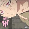
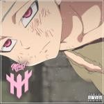
their are some stuff that needs to improve to begin with the render dont forgett it to place it according to the rule of the third more info u can find about it in wikipedia since the render feels a little bit to small.
Secoundly u need to fix the flow since as a viewer u kinda lose the focus from the charakter and the lighting gives it to much distraction.
Last thing is the lighting it feels to bright and giving some part a little bit burn will give the image a better feeling.
But in overall it is pretty ok u need some stuff to work on i suppose.
 Sign In
 Create Account